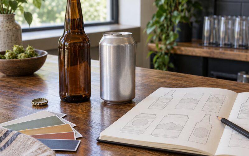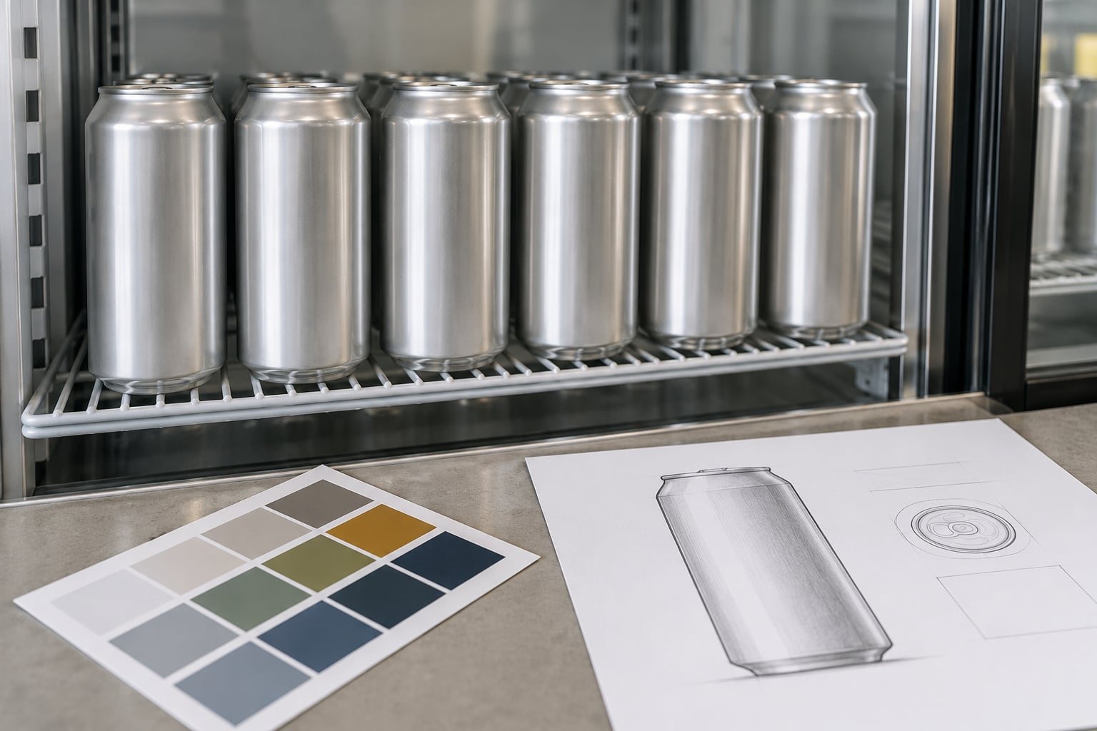
Beer can design affects sales because the can is the only part of a craft beer most shoppers ever see before they buy it. It decides whether the beer gets noticed on a crowded cooler shelf, whether the name and style can be read in the few seconds available, and whether the shopper remembers it well enough to buy it again next week.
The effect is measurable rather than decorative. In eye-tracking work presented by CODO Design at the Craft Brewers Conference, 88% of craft beer marketers said package design was important to their business. Craft Brewing Business has reported that 66% of craft beer buyers consider the package or label very or extremely important in noticing a beer.
So no, this is not decoration. It is the last point of contact before the pour, and it is where most of your sales decision actually happens.
Below is what moves units, what quietly costs you sales, and how to test a redesign without betting a whole print run on it.
Table of Contents
- What Does Beer Can Design Mean?
- Design decisions that move the most units
- How Does Can Design Influence Beer Sales?
- Which Design Elements Matter Most?
- Color that survives a lit cooler door
- A beer name that reads from across the cooler
- Style, ABV, and what to expect in the glass
- Finish and tactile cues
- Consistency across the lineup
- How Can Breweries Test a New Can Design?
- Build a shelf mockup and time the look
- Run a readability check under bad conditions
- Test whether the style reads
- Check color distinction in the same session
- Ship a small batch before a full run
- How Do You Measure Whether a Design Improved Sales?
- Set a baseline before you print
- Use distributor sell-through, not shipments
- Run a control-store comparison
- Add a short buyer survey
- Watch repeat purchase, not just the first week
- What Design Mistakes Can Reduce Beer Sales?
- Frequently Asked Questions
- Does beer can design actually affect sales?
- How long should a can redesign be tested?
- Will a more colorful can always sell better?
- How important is ABV on the front of the can?
- When should a brewery redesign its cans?
- Should I redesign before or after changing can format?
- Conclusion
What Does Beer Can Design Mean?
Beer can design is the whole packaging system, not a single illustration. It covers the can format and size, the artwork that wraps it, the type, the color palette, the imagery, the finish, and the order in which information appears.
Two things make cans different from bottles, and both change the design job. First, the surface curves, so artwork near the left and right edges compresses and distorts. Straight lines bow, and small type set too wide becomes unreadable. Second, a can lives in a cold, wet, brightly lit cooler, where condensation beads over ink and glare washes out light colors.
There is a third constraint people forget: required copy. Federal labeling rules from the TTB set a minimum type size for the net contents, the alcoholic beverage statement, the city and state of production, and the government warning. That block has to sit somewhere on the can, and whatever space it takes is gone for the part of the design meant to sell.
Design decisions that move the most units
Here is the short version for anyone who only has time for one section: the elements below are the ones with a documented link to a sales outcome. Everything else is preference.
| Design element | What it controls | How you would notice a change |
|---|---|---|
| Color contrast against the shelf | Whether the can is noticed at all | Time to first fixation in a shelf test |
| Beer name size and weight | Whether the beer is read in the available seconds | Time to locate the brand name |
| Style callout and ABV | Whether the shopper knows what they are picking up | Accuracy of style recall after a brief look |
| Illustration density | Perceived craft and quality | Rating of perceived value against a blind bottle |
| Finish, matte or gloss | Legibility under cooler glare | Readability score under simulated cooler light |
| Format and pack count | How many cans fit in the shopper’s hand or basket | Cases per store per week after a format change |
| Consistency across the lineup | Recognition of the brewery at the cooler | Unaided brewery recall after a shelf browse |
Format is the one people argue about least and it quietly matters as much as the artwork. A 16 oz can carries more volume per row of shelf and, in a four-pack, changes the block a shopper lifts. A slim 12 oz can stacks into more facings, which is the difference between a brewery getting eight facings in a cooler or four. The format dictates the artwork dimensions too, so a design drawn for a standard can will not sit correctly on a slim.
How Does Can Design Influence Beer Sales?
Understanding how beer can design affects sales starts with the fact that most purchases at a cooler are made quickly, in a few seconds, standing up, in front of a wall of competing cans. The pathway is short: notice, read, judge, pick up, remember.
Notice. Before anything else, the can has to break out of the background. Bright, high-contrast blocks are what pull the eye across a cooler door. In a Cal Poly study of craft beer buyers, shoppers pointed to bright colors as what drew them to a beer label close to 60% of the time. That is the first gate, and a can that fails it never gets read at all.
Read. If the shopper looks, they have roughly three seconds to find the beer name, the style, and enough information to decide. Eye-tracking studies of shoppers in front of beer displays use exactly this vocabulary: total viewing time, time to locate a brand, instances viewed, and whether the can ends up in the basket. A can with a busy background under a large name reads faster than the reverse.
Judge. Perceived value is set here. Clean printing, confident typography, and a finish that feels considered all push the same signal. The same eye-tracking work found that heavily illustrated designs and designs with a clear focal element outperformed the flat middle ground, and that the extremes in either direction did better than cautious, average-looking options.
Remember. This is where the sales effect compounds. A can the shopper cannot recall does not generate a repeat purchase, and repeat purchase is where a taproom-only beer becomes a grocery-channel beer. Purdue University research has found that roughly 75% of beer consumers will pay a premium for sustainably brewed beer, and C+R Research has reported that 76% of alcohol drinkers say price is not what drives their craft beer choice, with taste and quality leading. A design that says nothing about what the beer is leaves that positioning undone.
So there are two separate returns. The immediate one is a lift at the cooler, driven by visibility and readability. The longer one is brand recognition that makes the second and third purchase easier.
Which Design Elements Matter Most?
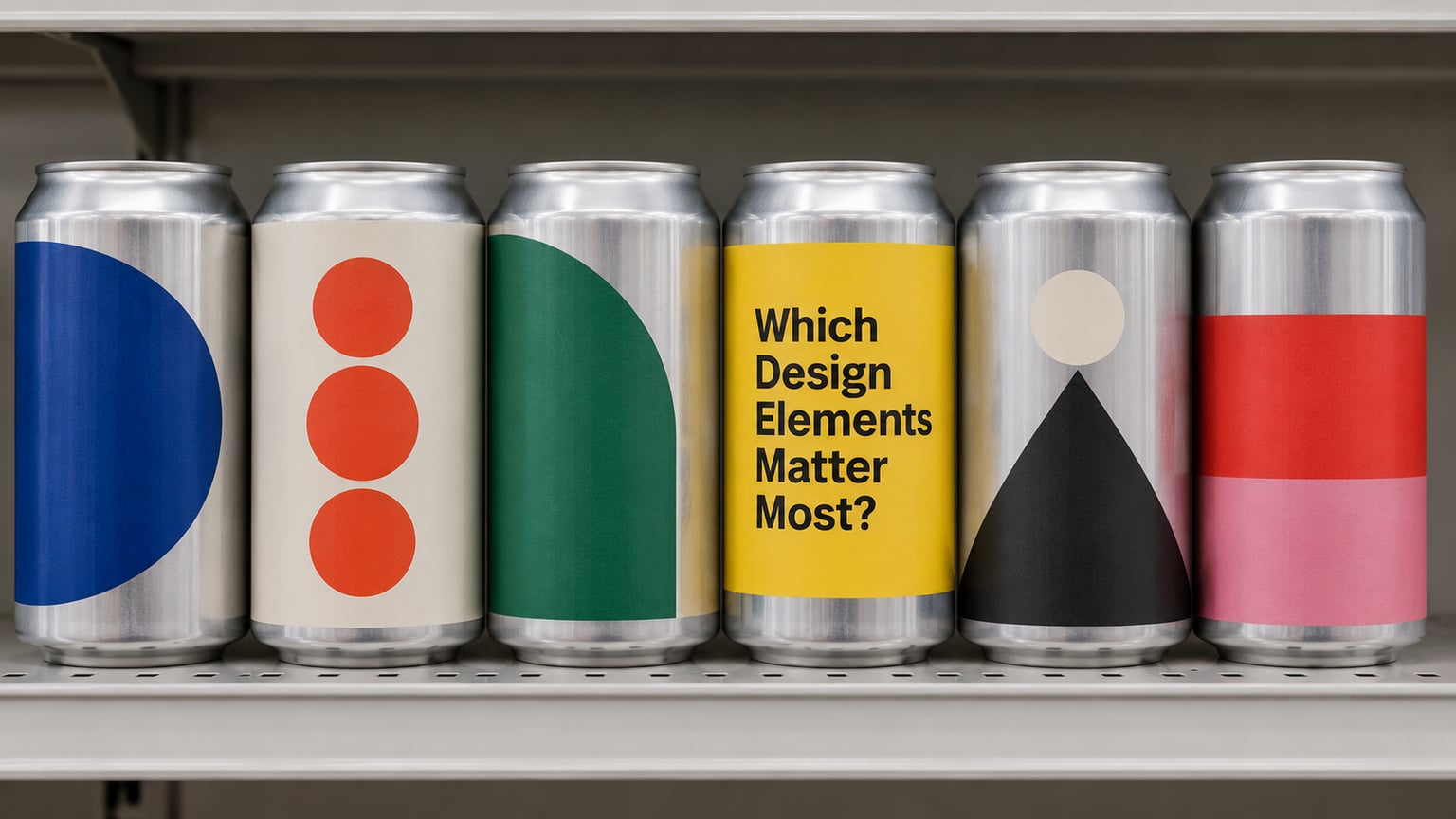
Ranked by how directly each one changes a measurable outcome, these are the elements worth arguing about.
Color that survives a lit cooler door
Contrast beats color preference every time. A muted palette can work beautifully in a photograph and disappear under the fluorescent strip of a cooler door next to eleven other cans. Test the palette against a light gray shelf and a dark one, and check it at arm’s length rather than on a screen.
Sustainability claims on the can only land if people can see them. Anything claiming recycled content or certified sourcing needs a legible seal and enough room to be read, which brings you back to how much space the required copy already took.
A beer name that reads from across the cooler
The name is the single element that must work at distance. Set it large, heavy, and away from the illustration so the two never fight. Because the can curves, keep type away from the outer edges where it compresses, and avoid fine weights that disappear under condensation.
Long names are the common failure. If the name needs a small subtitle to be understood, most shoppers will not stop reading it.
Style, ABV, and what to expect in the glass
A can that leaves the shopper guessing gets left on the shelf. Style name, ABV, and a short tasting cue belong on the front, sized so they can be read at the same distance as the beer name, just less prominently.
For a brewery with several beers in one cooler, this is where lineup logic pays. If every can uses a different visual system, the shopper has to work out the connection between them from scratch every time.
Finish and tactile cues
Matte, gloss, metallic ink, and embossing do different jobs. Matte cuts glare and makes light type readable under a cooler light. Metallic ink and spot finishes signal premium and catch attention across a room. Embossed detail is wasted in a cold cooler, where nobody is holding the can long enough to feel it.
Consistency across the lineup
One of the cheapest gains available. A shared color system, logo placement, and type scale across every beer tells the shopper that a second can from the same brewery is a safe bet. West Side Brewing in Cincinnati learned this the practical way: when they moved off shrink-wrapped cans to labeled blank cans, they kept most elements recognizable rather than starting over. Gradual changes preserve the recognition that repeat purchase depends on.
How Can Breweries Test a New Can Design?
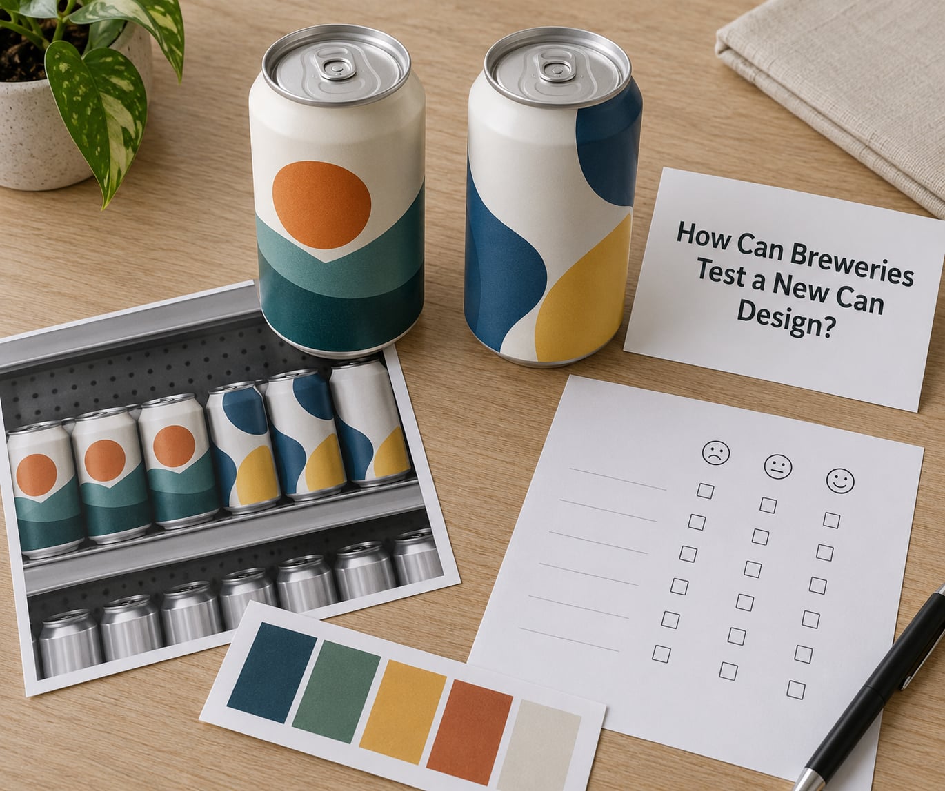
Testing beats debating. A few cheap methods catch most of the problems before a print run, and none of them require a full production order.
Build a shelf mockup and time the look
Print the candidate designs at can size onto card stock and stand them in a row with three or four unrelated cans for context. Ask people to pick up the beer they would buy. You are measuring time to first fixation, which can brand tends to lose because it is a familiar name and it is not in the test.
Run a readability check under bad conditions
Spray the mockup with water, put it under a bright overhead light, and view it from six feet. Anything that fails here will fail in a cooler on a Saturday. This step catches thin type, low-contrast pairs, and small required copy, which are the three most common unreadable combinations on a can.
Test whether the style reads
Show someone a can for three seconds, then ask what style they think it is and what they expect it to taste like. Confusion here means the front of the can is asking the shopper to do too much work.
Check color distinction in the same session
Put your full lineup on the mockup and ask people to find a specific beer by name. If two of your beers cannot be told apart quickly, the palette is doing too much or too little.
Ship a small batch before a full run
A limited release or a single-barrel run gives you a real test rather than a simulated one. Track which of your existing beers the new can pulls sales from, because a new design that just shifts volume between your own products has changed less than it appears.
Breweries posting on r/TheBrewery tend to describe the same gap: most owners and designers have no idea how to brief for a can. Give your designer the can dieline, the required copy, the format, and the finish before the first concept, not after.
How Do You Measure Whether a Design Improved Sales?
The honest answer is that sales numbers alone will not tell you, because a can redesign almost never happens in isolation. Price, seasonality, distribution gains, a new beer festival listing, a promo, and a supply interruption can all move units in the same window as your artwork change.
Isolate the design effect this way.
Set a baseline before you print
Pull the previous eight weeks of unit sales and depletion rate per store per week for that SKU, and write them down. Depletion rate is how fast a store sells through what you shipped it, and it is a cleaner signal than raw sales because it adjusts for how much product the distributor pushed that period.
Use distributor sell-through, not shipments
Shipments measure what you sent. Sell-through measures what the store sold. A design that scores well on shipments and flat on sell-through may simply have been over-shipped. Most distributors will share this by account if you ask before the redesign, not after.
Run a control-store comparison
Pick a set of stores that carry the new design and a comparable set that still carry the old one, matched on volume and format. Compare depletion rate week over week between the two groups. This is the cheapest credible test available to a small brewery and it takes one spreadsheet.
Add a short buyer survey
Two questions at the checkout or in your taproom email capture the mechanism, not just the result: why they chose the beer, and whether they had seen the can before. Recognition answers going up while depletion rate goes up supports a design effect rather than a seasonal one.
Watch repeat purchase, not just the first week
The first week after a redesign measures curiosity. The eight weeks after measure whether the design built memory. If week one lifts and week eight does not, the artwork stopped a browser once but did not build anything durable.
What Design Mistakes Can Reduce Beer Sales?
These are the problems brewers and design communities actually report, each with the fix that usually resolves it.
Artwork drawn for a bottle, put on a can. The industry shift from bottles to cans forced a lot of redesigns for exactly this reason. Fix: commission against the can dieline and check the type at the edges, not just the center.
Too many competing messages. An illustration, a logo, a name, a style, a tasting note, a locality claim, and a QR code all at equal weight means none of them is read. Fix: pick one focal element and rank everything else below it.
Small type, especially for required copy. The government warning and the rest of the mandated block get squeezed and then become unreadable in the exact conditions the can lives in. Fix: set the required copy first, then design the front around the space it leaves.
A layout that disappears in a lit cooler. Glossy light colors under an overhead strip read as glare. Fix: test the mockup under a bright light before approving.
Confusing style cues. A can that looks like a session IPA and pours like a saison turns a first-time buyer into a non-buyer. Fix: let the style name and the visual language agree.
A design that does not match the beer’s position. A minimal, restrained can on a beer you are trying to sell at a premium price sends a mixed message. Fix: decide the position first, then design for it.
A full rebrand when a refresh would do. Breweries cite this as a recurring budget problem. A rebrand throws away recognition you already paid for. Fix: change the color, the illustration, or the type scale and leave the rest alone.
Minimum order quantities that box you in. Shrink-wrapped cans commit a brewery to large runs of specific beers, which limits which beers can be packaged at all. Moving to labeled blank cans cuts the commitment and the cost per unit, which gives you room to run short quantities of new designs.
Frequently Asked Questions
Does beer can design actually affect sales?
Yes. The can is the only part of the beer most shoppers see before they buy, and eye-tracking studies of shoppers at beer displays measure how long they look at a can, how fast they find the brand name, and whether they pick it up. Designs that win those measures, large type, strong contrast, a clear focal element, translate into more purchases.
How long should a can redesign be tested?
Give it at least two full selling cycles, roughly eight weeks, and compare against the same weeks of the previous year if you can. The first week measures curiosity, the following weeks measure whether the design built memory. Also compare against control stores still carrying the old design, so a good month in the beer category does not get credited to your artwork.
Will a more colorful can always sell better?
No. Contrast against the shelf is what matters, not color count. A two-color design with a large name and a clean background can outperform a busy eight-color can because the shopper reads it faster. Test palettes on a mockup against competing cans, under cooler lighting and with condensation on the surface, before committing to a print run.
How important is ABV on the front of the can?
It matters for shoppers comparing options, and it belongs on the front, readable at the same distance as the beer name but less prominent. ABV also signals style to people who already know beer, so it does work that a tasting note cannot. Keep the required government warning legible as well, since that copy has a minimum size set by federal rule.
When should a brewery redesign its cans?
Redesign when the current can is hard to read, when the lineup has outgrown the current system, or when the format is costing you facings and volume. Refresh instead of rebranding when the beer still sells and only the artwork feels dated. If you are switching from shrink-wrapped cans to labeled blank cans, treat it as a refresh and keep the recognizable elements.
Should I redesign before or after changing can format?
Format first. The format sets the artwork dimensions, the shelf block shape, and how much room you have for required copy, so designing before you settle on the size means redrawing later. Several breweries have made the move off shrink-wrapped cans to labeled blank cans and used the flexibility to run new artwork on the same familiar look.
Conclusion
If you take five steps this month, start here. Write down the position of the beer in one sentence, since every design decision after that is downstream of it. Then build the front of the can so one element dominates and the beer name reads from six feet away. Set the required copy first so it does not squeeze the design later. Put the mockup under a bright light with water on it and see what survives. Then pick a baseline number, run a small batch, and compare sell-through against control stores before you spend on a full run.
That is how beer can design affects sales: it earns the first look, it makes the read fast, it says what the beer is, and it gives the shopper a reason to come back. None of it is complicated, and all of it can be checked before you spend the money.